Data Visualization
 |
PREETHI S, 23LSCG32; DARSHAN, 23LSCG14; DARSHAN R VEMULKAR, 23LSCG49, BCom VI Sem G, Department of Commerce, Kristu Jayanti University, Bengaluru, India |
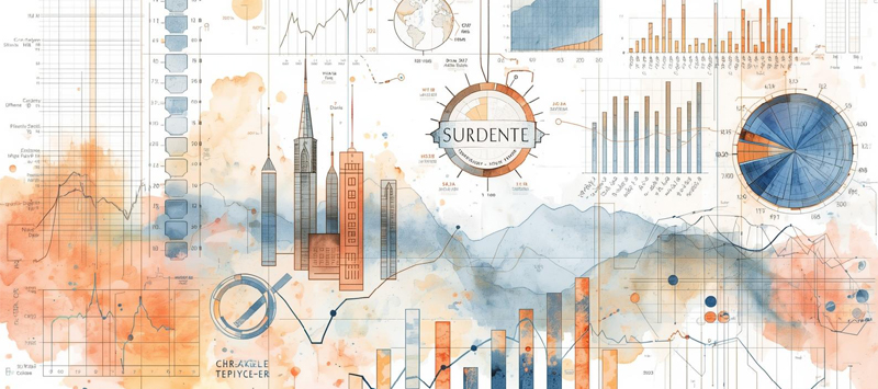
Data visualization is the graphical representation of data to help people understand patterns, trends, and insights more easily. By using charts, graphs, maps, and dashboards, complex datasets can be transformed into visual formats that are quicker to interpret than raw numbers or text. This makes data visualization especially useful for decision-making, as it allows viewers to identify relationships, outliers, and changes over time at a glance.
One of the main benefits of data visualization is improved communication. Visuals can convey information clearly to both technical and non-technical audiences, reducing misunderstandings and saving time. For example, a bar chart can quickly compare values across categories, while a line graph can show trends over a period of time. Compelling visualizations use appropriate colors, labels, and scales to ensure accuracy and clarity.
Data visualization is widely used across many fields, including business, science, healthcare, education, and journalism. Businesses use it to track performance and forecast trends, researchers use it to analyze experimental results, and journalists use it to tell data-driven stories. With modern tools such as Tableau, Power BI, and Python libraries like Matplotlib and Seaborn, creating meaningful and interactive visualizations has become more accessible, making data visualization an essential skill in the digital age.